Eat Creative
Client: EatRole:
Date: October 24th, 2008
If you’ve ever tried to make something for the company you work for, then you’ll understand the various internal hoop-jumping that goes hand in hand with that process. Internal projects often have a much longer timeframe than client projects. So, one year after I join Eat, we have our new website!
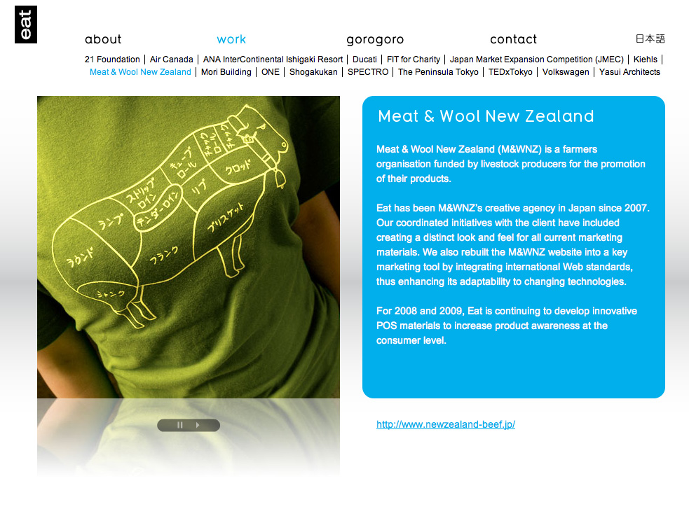
Cutting back with a lot of fancy bells and whistles, the aim of this site was to make something clean that would stand the test of time both aesthetically and technically. Take the client pages for example; we created a system that ‘reads’ how long an image strip is, applies the code automatically. So adding a new image is simply a case of editing the original and placing it back on the server. Our code figures out the rest. When filtering the type of work we do, various icons fade gracefully out of view.
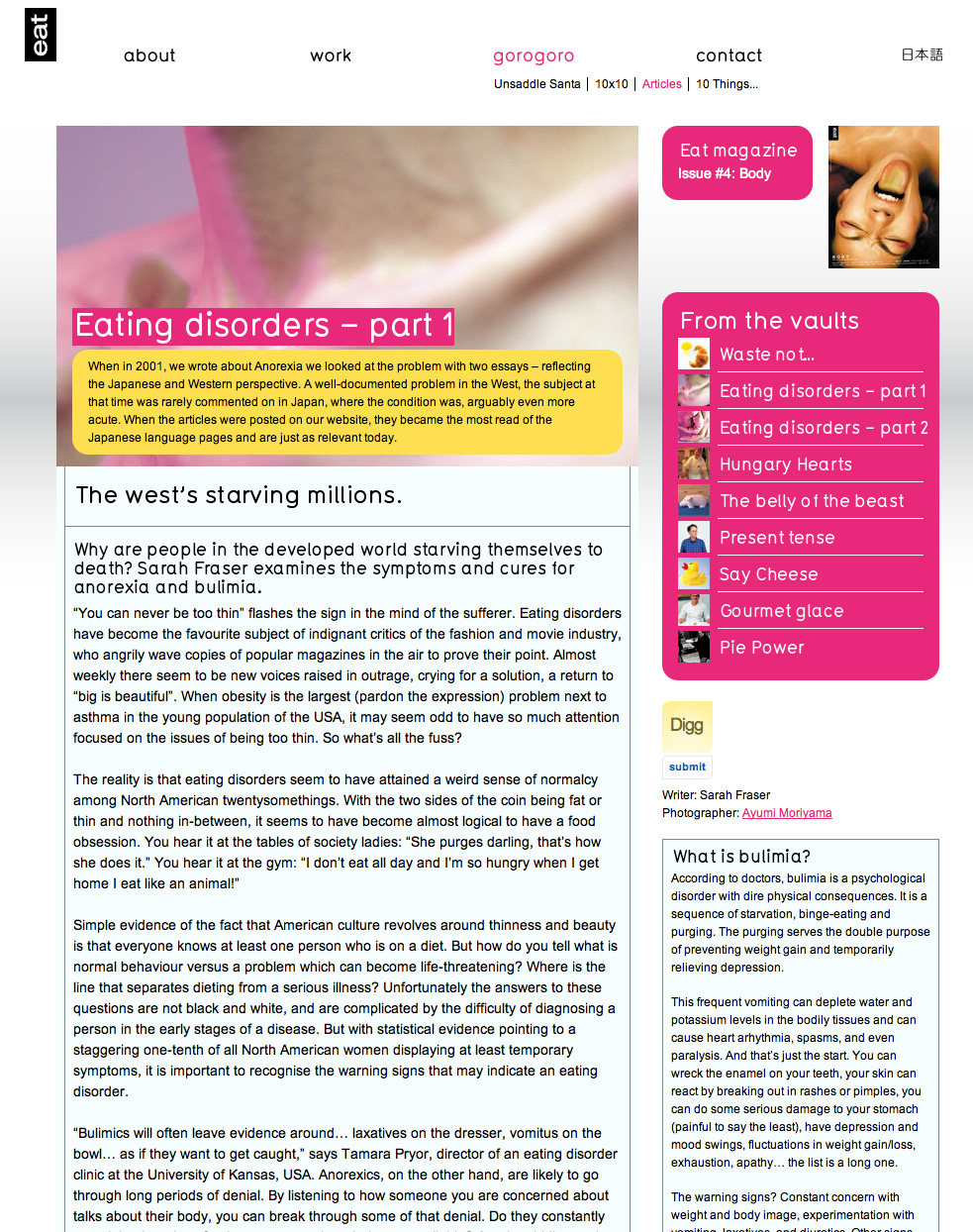
Rounded corners and custom fonts are handled with similar grace. Technically this site is above par, but let me offer a wider design and usability perspective: The site is navigated with 3 simple menu options, opening up the content fluidly. So simple but a complete nightmare to get right, take too much away and you get total mystery, add too much and you get confusion. A fourth section was planned with a blog, video etc called ‘gorogoro’. Currently this is planned as a phase 2
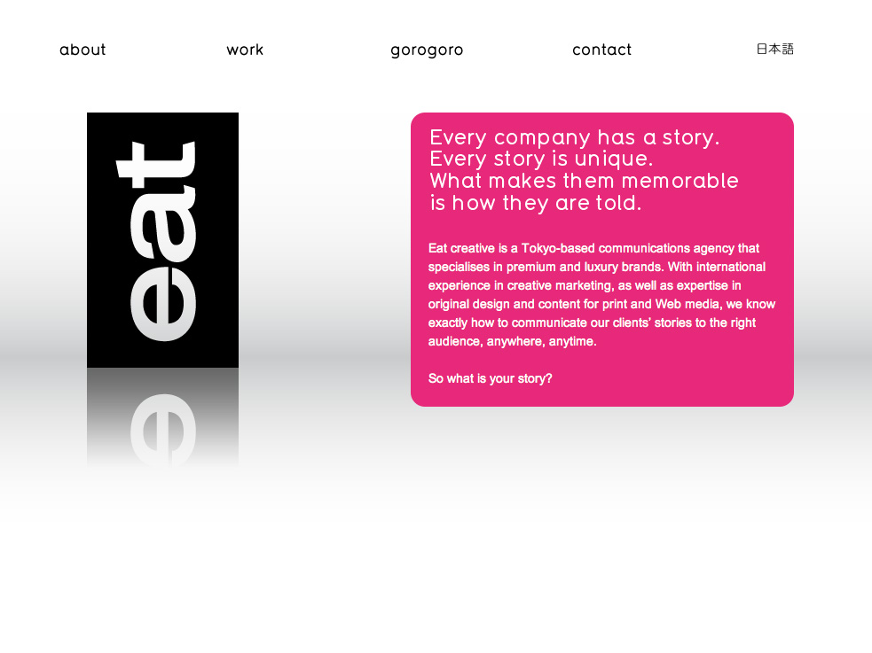
Eat’s top page is devoid of flashy intros, I went for a single large logo and a brief statement about Eat. To refine like this has always been my intention in all websites I create. Seeing this clearly takes a lot of perseverance and persuasion to go out on what is often perceived as a whim. I’m glad we did.
Previously, the old website suffered from being way too advanced for the job. A built in update system that never got used, stripped down to it’s bare essentials but also creating an information overload. The new website learns from the old, and offers people eye-candy with easy to read information that almost jumps off the screen into the eyes.
Achieving easy to read text on the internet is a combination of font size and juxtaposition. Text needs to breathe. So I made special instructions to the editors to give me text that has been formatted in this manner.
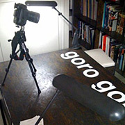
 For the Photography I erected a small studio in the office, shooting with my trusty post-war dSLR the Nikon D1h. A few people had to do without their desk lamps for my makeshift lighting rig during that time, sending them into consummate darkness – how very romantic – as this image illustrates.
So there you have it, Eat’s flagship to the world, offering both the best in communication and technical build. Many thanks to Erik, and everyone else involved.

