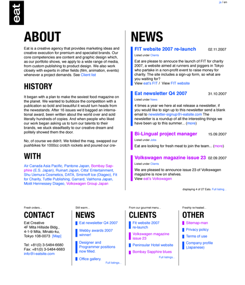
eat homepage
Client: EatRole: art direction
Date: May 1st, 2008
As part of the may 1st reboot, we decided to create a new look for Eat’s homepage, which has been out of date for quite some time.
Although in need of a facelift to something more web friendly that reflects the type of work Eat do, and the web standards it preaches; time has been in short supply.
Sometime in late 2007 I was drafted in to come up with an idea, art direction and make it work. I picked up this hot potato and ran with it!
Features include:
- no menu. I wanted the sites content to be the navigation. Was hard to wrangle the idea of sitemaps and menus away from Eat, but eventually I think we all agree that it works well without pre-defined menu items.
- accessible. One of the major concerns was to get google to pick up on the content and let users bookmark articles and so on.
- basic, content driven interface.
As the site grows and becomes an archive of everything Eat produces, it will start to take on a life of it’s own.