Logic Lingo
Client: Logic LingoRole: designer
Date: May 13th, 2008
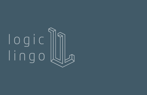
A good friend of mine asked for a identity to support his new translation company. I settled on an optical illusion for the logo, with two L’s fused together a la M.C.Esher. The font is the wonderful Neo Tech with a little bit of hand kerning.
In addition to the logo I delivered a simple bilingual website and business cards.