Meat website
Client: Meat & Wool NZ / Agency: EatRole: web producer
Date: September 1st, 2009
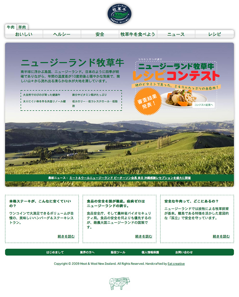
Meat & Wool New Zealand were looking to re-fresh their website, and rely on the great team at Eat Creative to make that wish a reality. The new website is born!
Taking a “from the ground up” approach and realising that now the brand has been furthered in the Japanese territory, it was time to evaluate the existing website (which I built a couple of years back).
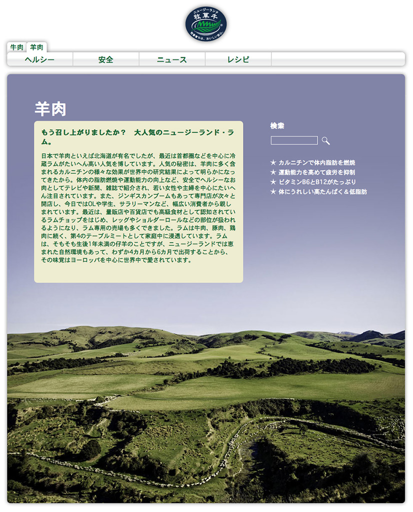
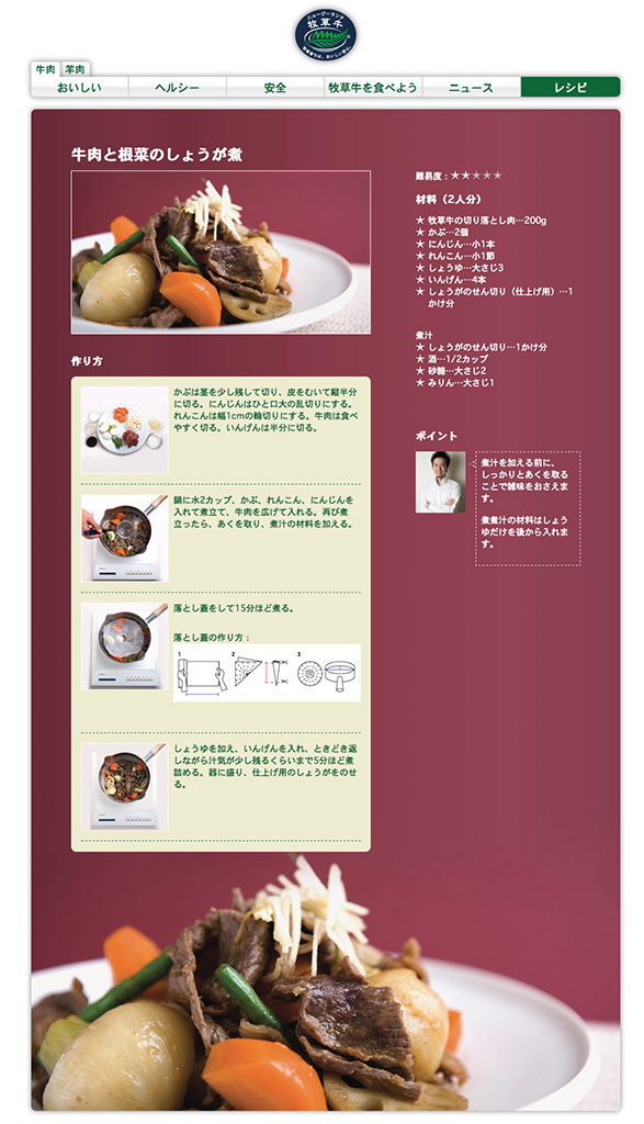
While browsing some of the new photography, I came to think it would be nice to have these beautiful large pictures in the background instead of pictures contained inside the design — kind of inside-out design if you will. This is the real base for the overall site, from the information pages to the recipes right down to the terms and conditions pages. The rest of the design flowed from this simple choice — based on our “house” grid.
This redux also called for a new way to run the site, so we chose drupal as the final base. Working with this structure has allowed us to add features we would otherwise think twice about including. So far it’s been a pleasure, thanks to the wizardry of Erik Johansson.
Now back by a cookery campaign for it’s launch on all the major Japanese cookery websites, we are keeping our fingers crossed for a definite hit.
So if you can read Japanese, and like beef or webdesign, come have a look!

